'Supervolts No.1, Acrylic on canvas, 183cm x 183cm, 2008
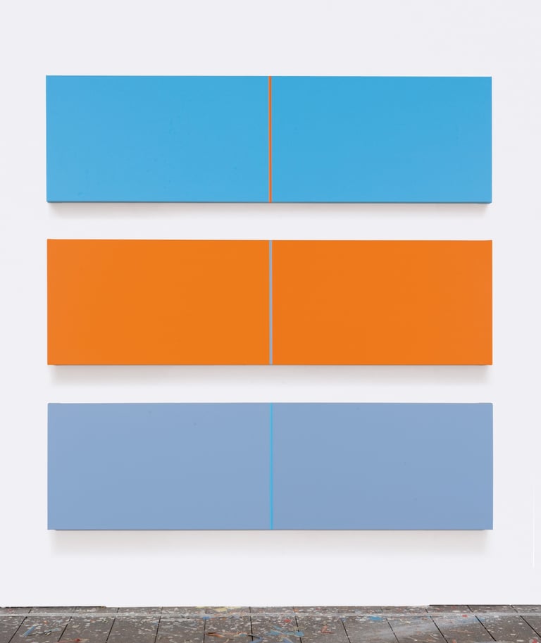
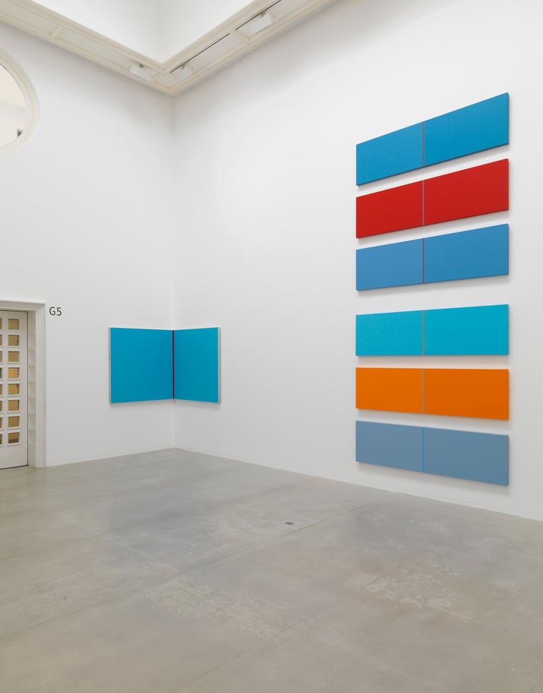
Tate St Ives, 2009
All images copyright Luke Frost 2025
© Luke Frost 2025. All rights reserved.